Creating in lockdown

I had four months in isolation this year when I found it impossible to lift a pencil or brush, despite having time on my hands. A combination of anxiety, depression and brain fog due to being locked down during the covid pandemic made it very hard to focus or concentrate. I could barely get out of bed in the morning and despite feeling lonely, I found it hard to talk to friends, even through social media.

Three weeks ago, I escaped to rural Victoria on a care visit to my Mum and sister, who had fractured a wrist and fibula respectively. I had a covid test when I arrived and isolated for three nights in a hotel. Then… I was free! I feel for my Melbourne friends who are still under a curfew, although a bubble for single people living alone has been introduced. We will get through this, but it has been tough on everyone in different ways, according to their living situation.

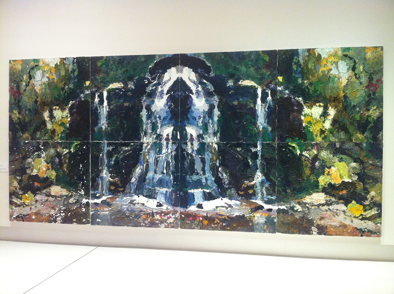
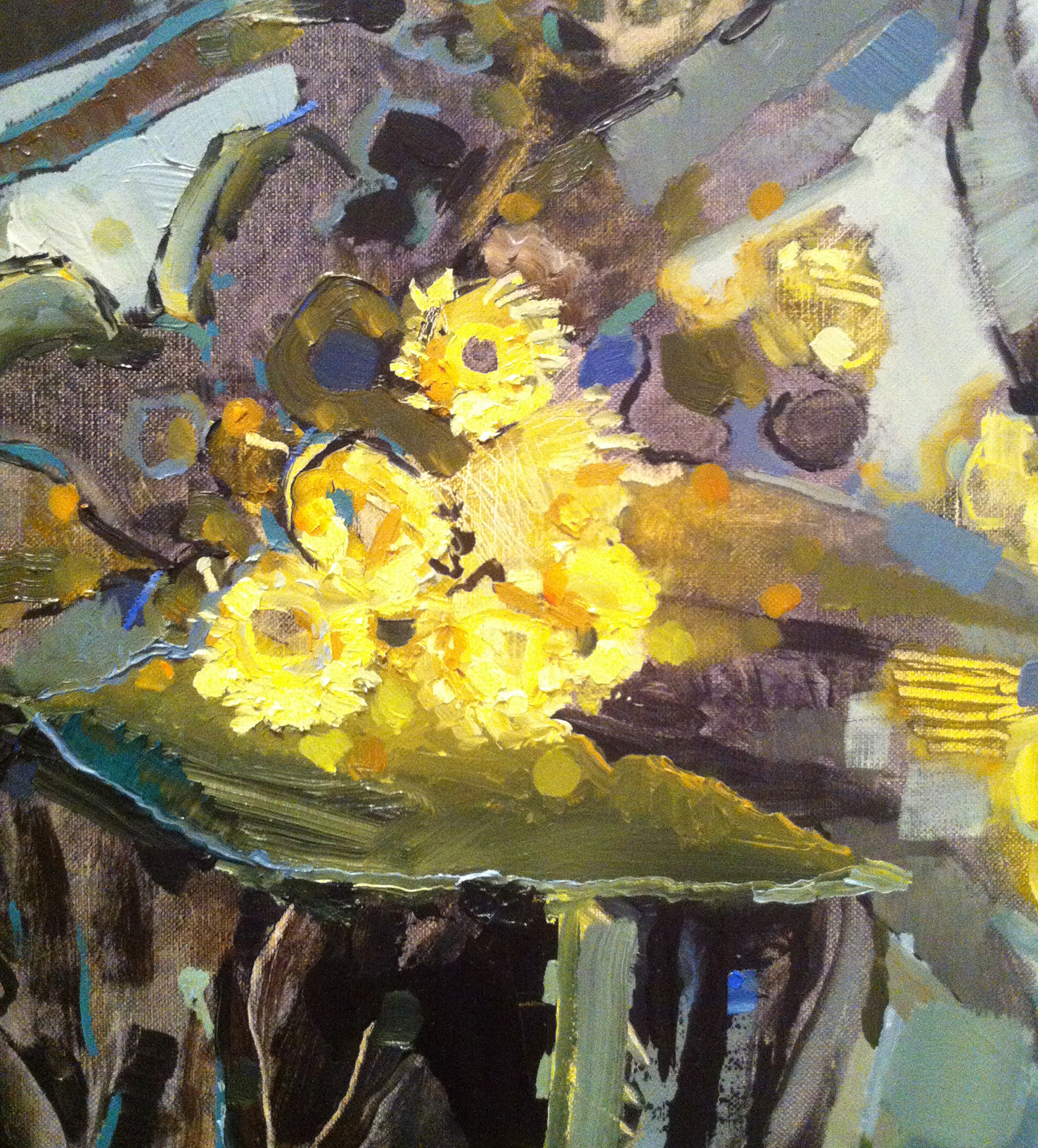
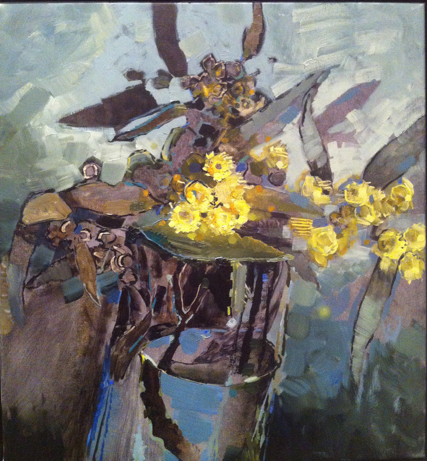
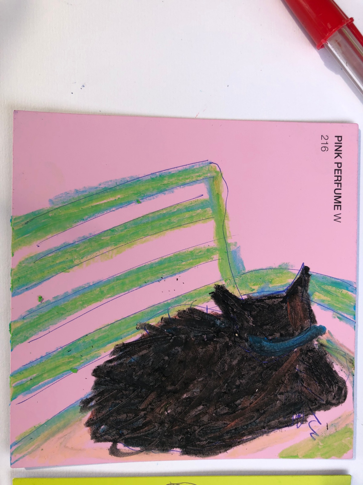
For the first time in months I was able to do some quick sketches on paint colour swatches. I can feel my artistic motivation returning 🙂

PINK

Recently I noticed in the new seasons fashions in my local boutique, there was a lot of pink. Fuschia, cranberry, peach, hot pink etc. I resolved to buy a few new items of clothing because I can’t remember the last time we had so much strong pink around.

Strangely when I popped in to see my florist friend, she also mentioned that the trend in flowers is also currently ‘pink’. I was inspired to get out my pink paints and my beloved fluoro pink at the studio:

The other interesting thing about pink is how emotive a colour it is. From babyhood, girls are traditionally dressed in pink and boys in blue… I have heard people say they hate pink! Shocking Pink was the signature colour of Elsa Schiaperelli. Bright pinks certainly polarise opinion. I can unashamedly say I love pink đź’• and also red and pink together (as seen in Marimekko designs). Viva la rose!

Art opening shoes — 1 of 7

When I was at the White on White opening  I remembered an idea I’d had before when at exhibition openings — photographing a series of people’s shoes. The idea of portraits of people’s shoes interests me, and it’s interesting how many people feel braver in wearing colourful/wacky accessories like earrings or shoes than in their clothing. I think the photos give a good sense of the event as well…

Presenting the first installment of a series:

White on White: celebrating 20 years of the Fiona Myer Award at Victoria University, 18 November 2019.

A commission


I recently finished a commission for my mother. She wanted some small works on paper depicting my Dad’s farm as a gift for him. We took some photos of the farm and a ruined cottage there, and she picked out which photos she liked best.

I decided to use pen and ink (or fineliner) with subdued watercolour, after I did a couple of roughs that she didn’t like. I photographed some of the work in progress and she ok’d them so I did some more. Now they just need framing. I hope my Dad likes them; I think they’ve turned out well.

colour bomb! update

I did it!

Thanks to everyone who supported by donating to my fundraising campaign, my fellow artists who inspired and helped me, Tracey and Gasworks, and my friends who encouraged me.

finally, a solo show

I’m excited to announce my first solo exhibition! Colour Bomb! will open on November 20. I think I’m almost ready, but we’ll see how the last 10 days go. I’ve done almost all the paintings and pieces, and I’m framing them at the moment (and working on a special 3D piece).

Here are some samples to whet your appetite…

Colour Bomb! opens on Tuesday 20 November from 6pm at ARB Gallery, Gasworks Arts Park, 21 Graham Street, Albert Park. I’d love it if you could come and celebrate with me!

If you can’t make opening night, the show runs until December 9. I’ll be sitting the gallery on the weekends of 24/25 November, 1/2 and 8/9 December from 12 until 4pm. Hope to see you there 🙂

p.s. I also have a favour to ask… I’ve set up a crowd funder to help cover the gallery hire and costs of the exhibition. If you’d like to support an emerging artist, go to http://www.pozible.com/project/first-solo-show

The 64th Blake Prize for religious art

A selection of work from the Blake Prize is showing at Wangaratta Art Gallery until 8 January 2017. Highlights for me were 1. a marble sculpture by Robert Hague, ‘The Messenger’ which depicts a severed head veiled in drapery. It is reminiscent of funeral monuments and quite beautiful, and also a bit creepy. A small bird is carved the figure’s throat.
2. ‘Kenosis’ by Yardena Kurulkar, which won the prize. A series of photos showing the disintegration of a terracotta heart. The heart is a replica of a human heart and is shown in stages of weathering until it dissolves. An interesting and powerful concept.
3. ‘Kurtal’ by Tom Putuparri Lawford. I thought this looked like a cross, a traditional looking indigenous object with a black body and white feathers sticking out from the top. It’s made from human hair among other things, and is actually a headdress to be worn during rain bringing ceremonies in the desert.
4. A collaboration between an Australian and a Balinese artist. I didn’t take note of the name of the work or the artists, and I haven’t been able to find it online. The work is dominated by traditional Balinese paintings of the nine gods that protect the island. Small paintings of tourists have been added, basically ‘partying’ and exploiting the native population in their search of a good time. It shows the ugly side of Australian tourism to Bali, but it looks like a beautiful tapestry until you start looking more closely.

The Blake Prize was started in 1950 to encourage religious art, and conversations about faith, spirituality, religion, hope, humanity, social justice, belief and non-belief. The entries are not restricted to works related to any faith or any artistic style, but any work entered must have a recognisable religious or spiritual integrity.

The Messenger -- Robert Hague
The Messenger — Robert Hague

Kenosis -- Yardena Kurulka
Kenosis — Yardena Kurulka

Kenosis -- Yardena Kurulka (detail)
Kenosis — Yardena Kurulka (detail)

Ben Quilty

I visited the Bendigo Art Gallery last week to see the Ben Quilty show. I’ve been a fan of his painting since I saw one of his car crash paintings and a documentary about him where he spoke about Australian masculinity and what inspired him. European settlement and the plight of Indigenous Australians are ongoing themes in his work.

What fascinates me is the amount of paint he uses! When I look closely I always wonder how long his work must take to dry. I love his dramatically rough painterly style.

Kuta Rorschach No. 2, 2014, oil on canvas (detail)Kuta_Rorshach_detail

Three of his Rorschach series of large landscapes are almost symmetrical mirror images, reflected from a central vertical axis.
Fairy Bower Rorschach, 2012, oil on linen (detail)Fairy_bower_rorshach Continue reading “Ben Quilty”

Tony Tuckson

Twenty-two of Tony Tuckson’s beautiful abstract paintings have been bequeathed to our public art galleries by his widow Margaret, who passed away in September.

Tuckson was deputy director at the Art Gallery of New South Wales from 1957 until his death in 1973, and the conflict he perceived between this position and his art practice made him reticent about exhibiting his work.

Untitled – yellow 1970–73

Continue reading “Tony Tuckson”

Geelong Contemporary Art Prize

I visited the Geelong Contemporary Art Prize recently. Forty-two painters make up a diverse show ranging from figurative and photorealistic painting to text-based and abstract work. I love painting and I enjoyed the wide range of styles and techniques used.

Adam Pyett’s Flowering Gum had deliciously thick paint and brushstrokes, scrapes and roughly applied patches of colour showing some of the underpainted canvas. I loved the sketchy and spontaneous quality of the work.

flowering_gum_detail

Flowering_gum_Pyett
Continue reading “Geelong Contemporary Art Prize”