These pics were taken in a small laneway off Footscray’s Nicholson Street Mall. I liked the graffiti and tagging beside the official mural art, demonstrating the ephemeral nature of street art.

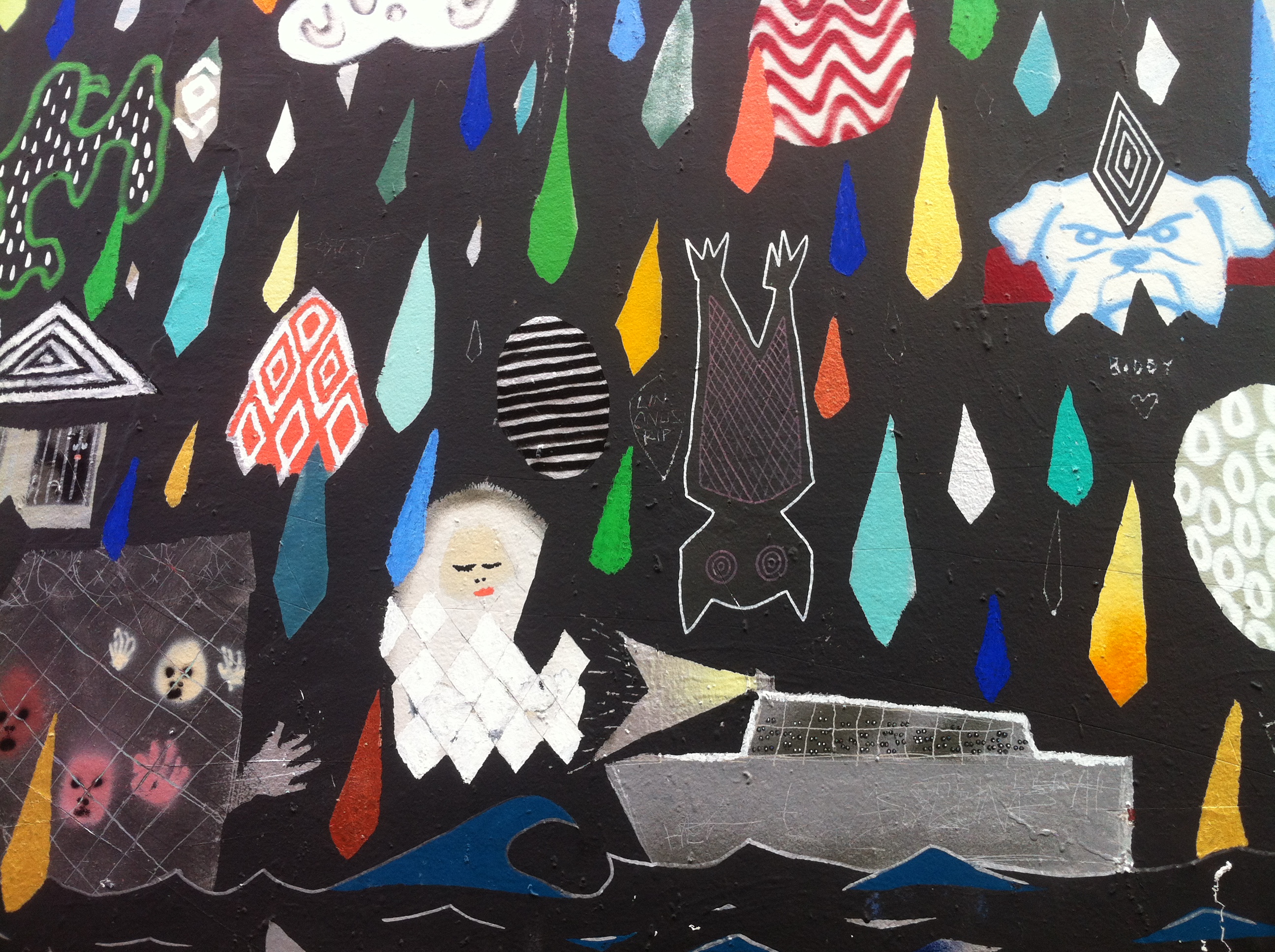


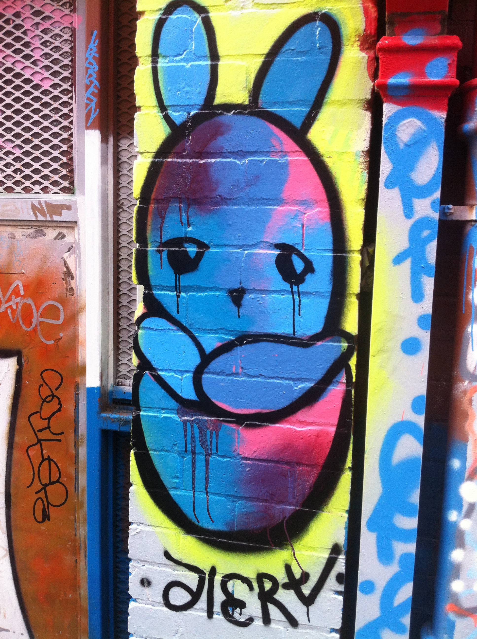
These pics were taken in a small laneway off Footscray’s Nicholson Street Mall. I liked the graffiti and tagging beside the official mural art, demonstrating the ephemeral nature of street art.
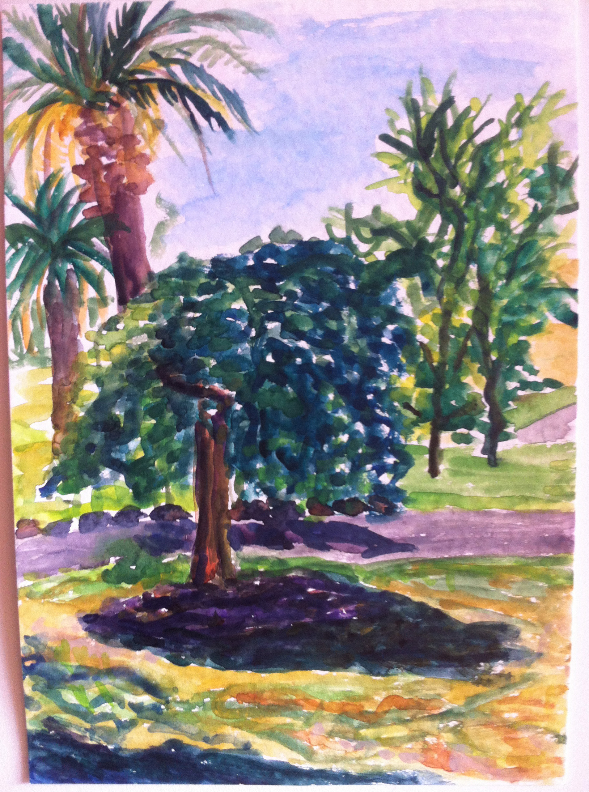
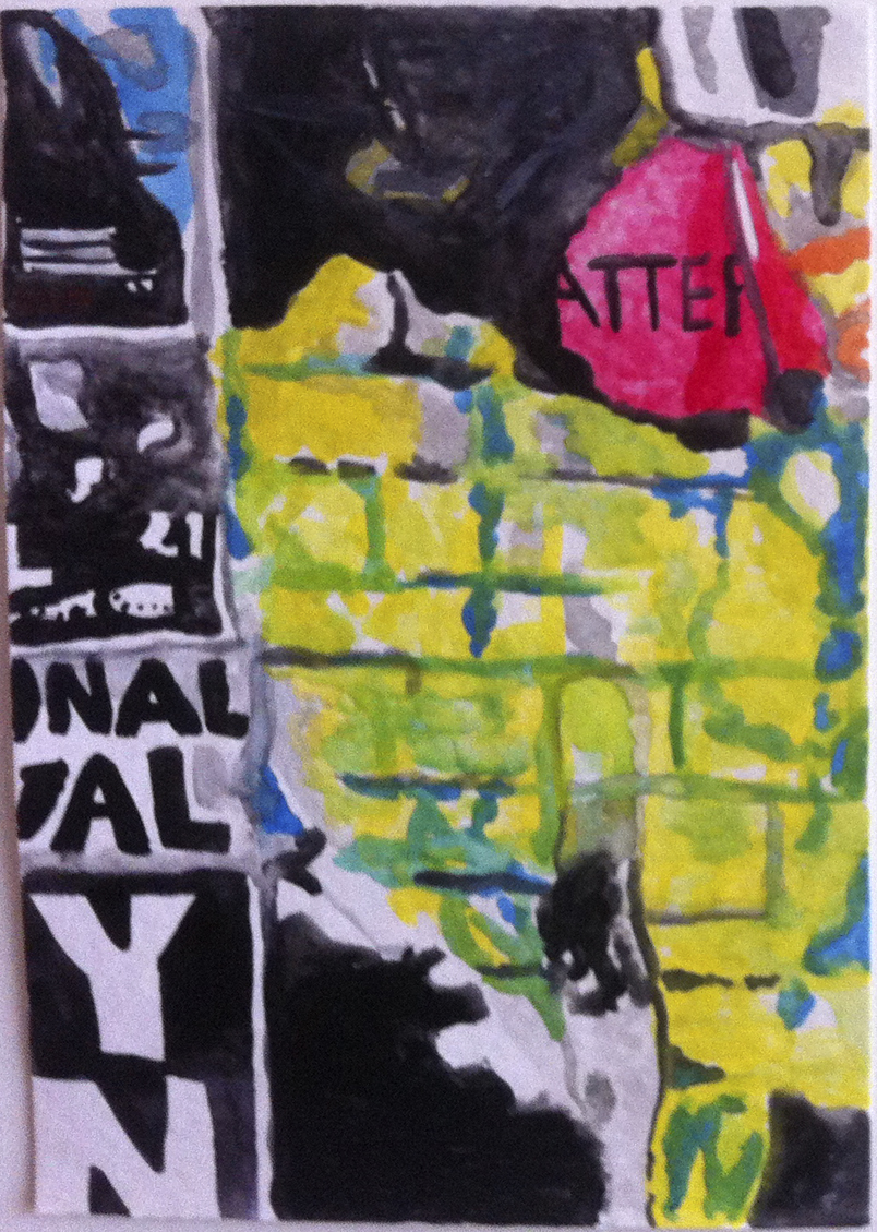
Yarraville park, watercolour on paper, 2014
Standouts from a short visit to Melbourne Now at NGV St Kilda Road:

Agatha Gothe-Snape’s video screens installation Powerpoints (above). This work looks very much like advertising with ‘slogans’ and snippets of text that cycle continuously. I liked it a lot.
Daniel Crooks’ video work An embroidery of voids 2013, was also a favourite. Spliced footage of Melbourne laneways and back alleys takes you on an imaginary tour. It is mesmerising. There’s a sense of menace that seems to be building up to a violent conclusion due to the atmospheric soundtrack, but nothing happens.
Anastasia Klose’s Popup Shop, where she is selling Tshirts and other merchandise. Playing with the idea of the artist as a product and ‘selling out’, Klose is a charming salesperson for her ‘souvenirs’.
The volume of work means this is a show to return to several times. The show runs until 23 March 2014.
I was excited to attend the opening of the Substation Contemporary Art Prize last month because my friend David Thomson was one of 50 finalists in the exhibition.
Overall I was disappointed with the exhibition. The three prizes awarded were all for video works. There were about 13 videos in the show. The SCAP is intended to ‘recognise and encourage innovation in contemporary art practice’.
A video work has to grab my attention or entertain me in the first minute or I turn off. We are so bombarded by video, TV, advertising, movies, music clips, youtube, that video art has to be really clever or beautiful to stand out (and preferably short!) I dislike work with an obscure conceptual artist statement full of big words that I can’t understand, that I suspect is actually meaningless art wank.
You shouldn’t have to study art theory or have specialist knowledge to appreciate an artwork. I love art, and have studied it for four years, so if I can’t understand the concept behind an artwork, how is the average viewer supposed to understand it?
In the project, by Eric Bridgeman, was a video diary filmed during a artist residency in Canada in 2011. Bridgeman dressed up as a golliwog character and cavorted around his studio in front of a camera. I thought it was self-indulgent narcissism, and I couldn’t believe it when it won first prize and the judge described it as a ‘layered work’ about being an outsider. I don’t understand how this work has any more artistic merit than, say, reality TV footage or an amateur video diary on Youtube. I couldn’t watch the whole thing, I found it repetitive and boring.

Still from In the project, Eric Bridgeman, video/DVD, 2012
I think that in 100 years time, video art may be seen as a fad in modern art from the 1960s until now, especially popular since the 1990s. After several decades, the medium is hardly ‘innovative’. The art world is cyclical. It depends on what the art schools are encouraging students to do, and critics and curators are promoting, and it seems they are still pushing video and multi-media work rather than traditional painting, drawing and printmaking. Continue reading “The Substation Contemporary Art Prize 2013”
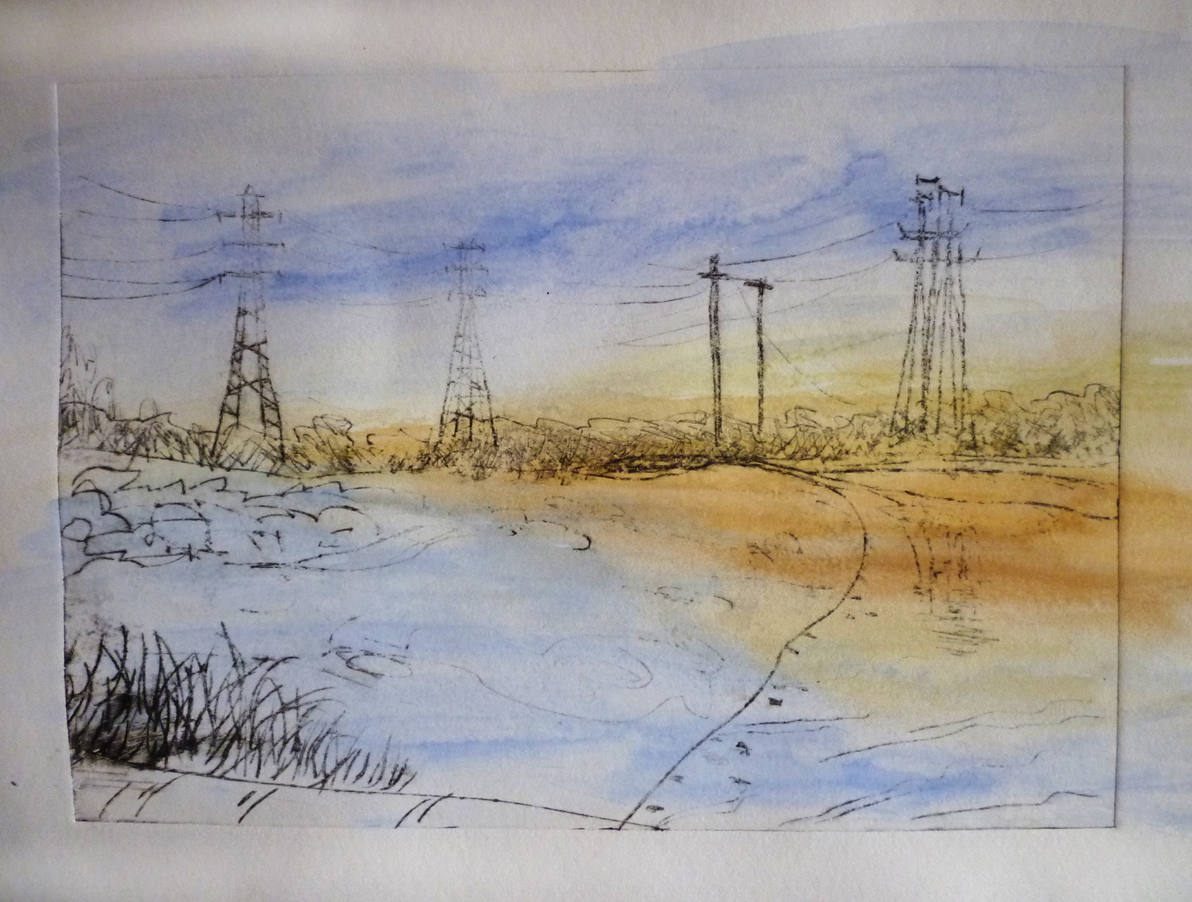
I’ve just finished painting a series of water colours of my train trip home from Flinders Street Station to Yarraville. It’s a trip I’ve taken many times, and when I arrived home it was ‘the blue hour’ – twilight.
Last semester in printmaking I made a series of prints using my local industrial landscape of Melbourne’s inner west as inspiration.
These are photopolymer prints from my photograph of an electricity pylon and the West Gate Bridge.
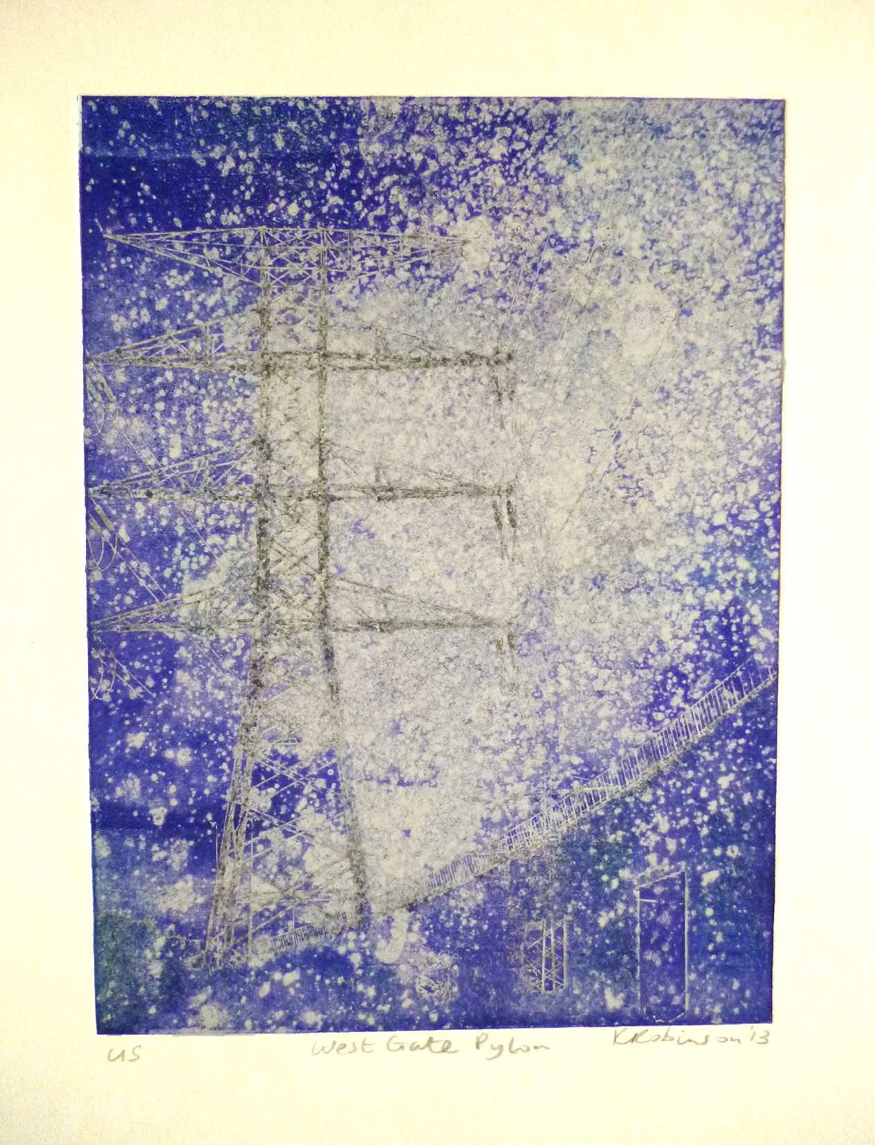
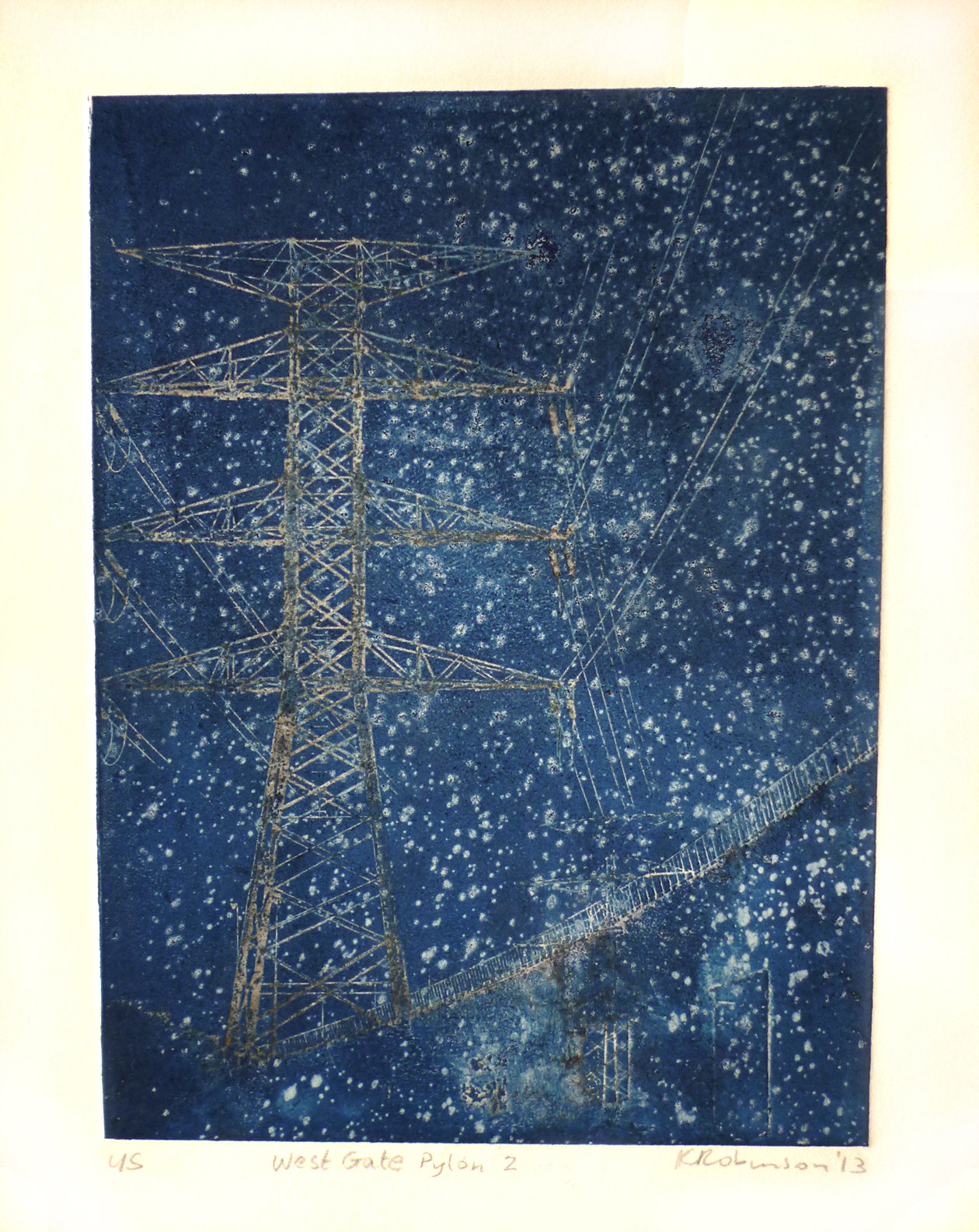
I also did some drypoint etchings, some of which I hand coloured with water colour and ink.

A few weeks ago now I visited the Monet exhibition at NGV. Absolutely loved it. I remembered seeing some of his paintings in Paris years ago at the Musée d’Orsay and L’Orangerie, but it was lovely to see so many of his paintings here in Melbourne.
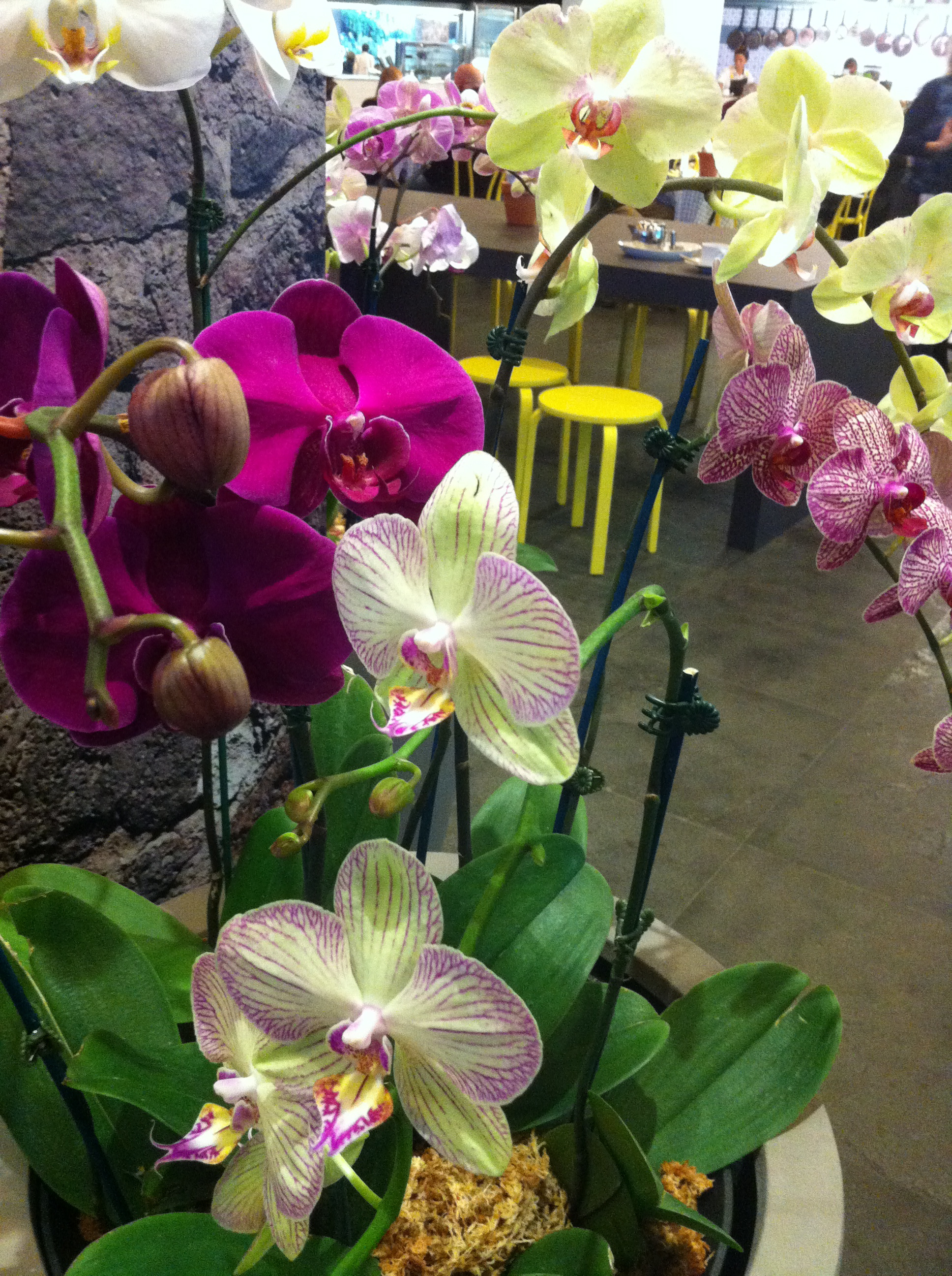
The cafe was appropriately decked out with orchids…
It was interesting to see some works I hadn’t seen before, like the landscape ‘Field of Yellow Irises at Giverny’ which had a freshness in the bright yellow, green and pale blues, and a beautiful sketchy roughness. There were also paintings of weeping willow trees in reds, browns and greens that I’d never seen before.

One of my favourites was a large painting of water lilies and agapanthus in greens, purples, yellows and pinks. I loved the unfinished section in the in the bottom corner that showed bare canvas. When you look at his large almost abstract portrayals of reflections on water and lilies, you can see he was a forerunner of abstraction.

There was also a beautiful video of Monet’s garden. At the end of his life Monet had cataracts and after being operated on, his colour perception changed dramatically – what a terrible thing to happen to a master of colour! The notes said he wanted to destroy some of his earlier paintings, but fortunately he didn’t. His round wire-framed glasses are displayed in a case along with a wooden palette and a pipe. The exhibition runs until 8 September.

I sometimes work at an office in Bourke Street, and have often noticed this angel sculpture, high on a wall next door to an office building at 160 Queen Street, Melbourne.
I finally decided to photograph it recently. Unfortunately I couldn’t find out any information about the sculptor, and there wasn’t a plaque at the site (that I could find), but it is quite beautiful. The figure looks futurist to me, stylised and holding a wheel. If anyone knows more about it please contact me…

I’ve been really busy with my day job and study lately, but have finally added two more watercolours to the Palimpsest series. Sorry about the poor photo quality, these were taken with my iphone. By the way, I’m officially addicted to iphone. Darn it.

 Today I visited I thought I was where I wasn’t at C3 gallery at Abbotsford Convent – paintings by Shannon Smiley and pen and ink drawings by Helen Nodding. Shannon’s paintings are of fragments and forgotten corners of vegetation in the urban landscape that demonstrate the power of nature to reclaim our city environment. I find his paintings inspiring and powerful.
Helen’s meticulous pen and ink drawings are detailed examinations of everyday scenes – tree branches reflected in a ditch or a weed breaking through a footpath – beautifully recorded.
